Redesigning all navigation elements for a complex university website
Leading the redesign of Curtin’s website navigation and way-finding elements to help users to find what they’re looking for, orient themselves, and discover content.

Overview
Curtin university is one of Australia’s top universities. In 2022 they were in the middle of a digital transformation and keen to make some large scale updates to their digital experiences.
The aim of the project was to improve the navigation experience and interface of their website so that students and researchers could easily find what they were looking for and complete essential tasks.
Role
Lead UX designer
Client
Curtin University
Services
UX/UI design
UX Research
Completed
August 2023
Impact
5/5 score for find-ability
Post-release testing showed students can easily find courses and campus experience content.
Improved content discovery and browsing
Students engage in more scanning behaviour and are able to more easily identify page labels that are relevant to them, as seen in post-release user testing.
12% increase in traffic to level 2 pages
Improved traffic to pages that were previously only accessible via in-page links.
Initiated a wider IA improvement project
User testing insights from this project helped the organisation understand the need for a shallower, more refined information architecture.
Background
I had only just started the role as lead UX designer when this project landed on my desk. It was one of those monstrous pieces of work that had been half-cooked by several designers before me, and I was tasked with picking up where they left off. To add to the complexity, I was the only UX designer on the team at the time.
Curtin’s website, like many university sites, was big and complex, with information architecture spanning up to eight levels in some areas.
It was hosted on WordPress, which allowed each faculty and department the freedom to manage their own content. This lead to frequent updates, the addition of new pages, and inconsistent content management practices.
There was no system or easy way to manage what was published, this meant the site was rife with duplicated content, redundant pages and poorly named labels that only added to the confusion.
Scope restraints
The brief was clear: improve the navigation experience without touching the underlying information architecture. Despite my attempts to persuade the organisation to consider a more fundamental overhaul of the IA, I was too new to the role and the project was already too far along for such a shift.
However, user testing insights gathered from this project helped the team understand just how much an updated IA could improve the overall user journey. This would be a project for me a year later.
the process – part one
Discovery and problem definition
Understand the true problem
To get a more holistic understanding of the problem users were facing, I reviewed existing user research and completed some of my own. This included:
- Heuristic evaluation on the existing design and review of previous efforts to redesign the interface
- Reviewing past rounds of user testing
- Stakeholder interviews (including faculty, research teams and branding)
- Website data analysis (Google Analytics, heatmaps, GetFeedback surveys, etc.)
- Discovery workshops with key site editors (digital marketing team)
I summarised my findings into these key problem areas
Menu structure and discoverability
Users can only navigate up to 2 levels of the IA using the main menu, from there, they were required to scroll endlessly through long pages of content in hopes of stumbling upon what they needed.
Find-ability
Users struggled to complete core tasks such as apply for courses because they didn’t know where to find them. Content was buried under layers of pages.
Orientation
Once on the site, users had trouble understanding where they were, how they got there, and how to get back to where they started. The site also lacked basic way-finding elements such as breadcrumbs.
Solving the symptom
While an updated interface would help address these symptoms, the underlying issues with the information architecture and site management would need to be tackled in a separate project.
I used this as an opportunity to refine the project objectives and align the team on user goals.
Objectives
- Help users find what they’re looking for without frustration.
- Provide clear orientation so users know where they are and how to get where they want to go.
- Improve content discovery by making it easier to browse and explore.
- Ensure navigation elements are accessible across all devices.
User goals
- Find a course relevant to me
- Browse different areas of study that might be relevant to me
- Find information about living on campus
- Find information about why Curtin University is right (or not right) for me
- Find information about additional activities, and things that Curtin offer, that will enhance my university experience
- Know where I am in the site, know how to get back to where I was and know where I can go next
the process – part two
Research and design patterns
I began by conducting a competitor analysis, reviewing best practices in navigation UX/UI, and explored innovative ways to improve how information can be structured and accessed.

I landed on the following design patterns to explore further
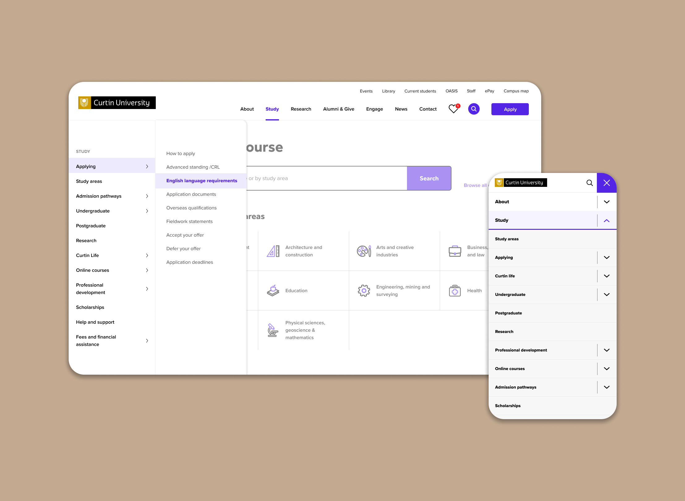
Mega menu
An element that’s ubiquitous in university website design, this would allow users to see the top 2-3 IA levels at a glance.
Local navigation
This would ensure sibling and child pages are readily accessible, without relying on on-page links or discovery.
Sectional menu
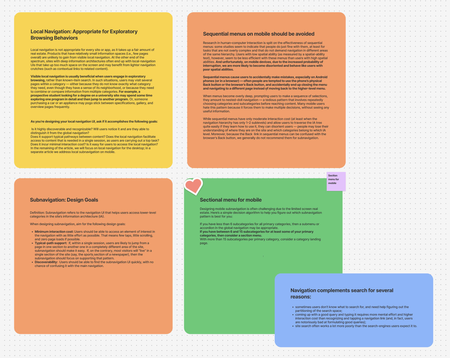
This one seems great for deep IA’s. Instead of allowing users to travel to the deepest level of the site from one menu, they are introduced to new levels of the IA as they become relevant via local navigation.

the process – part three
Design and development
Wireframes
Here you’ll see experimentation with placement and functionality of the side navigation bar. I’m exploring depth of navigation and if it should have a fixed visible position or be hidden behind a hamburger icon.


The endless accordion or sectional menu?
From there, I explored several iterations, testing how many layers deep the navigation should allow users to go. I prototyped two approaches for the mobile menu:
Sectional menu (stepped approach) – users can only travel up to 3 levels of the IA at a time. They are introduced to new levels as they travel deeper into the IA.
Endless accordion – users can navigate to the deepest level of the IA via the hamburger menu

Sub-site user flow

the process – part four
User research
Round 1: Testing with Current Students
Method
- Test a hi-fidelity interactive prototype of the desktop and mobile design
- 12x 45 minute interviews with current Curtin students
- 6x mobile and 6x desktop
Objectives
- Understand how effectively the new navigation design solves for the core user goals
- Identify key points of friction in finding information
Example tasks
- Find something you’d like to learn at Curtin
- Sign up for a club on campus that interests you
- Find a fun activity you can do at Curtin in your down time when you’re not studying
- Show users a random page of the site and ask:
- Pretend you just arrived at this web page. Where are you on the website?
- Prompt “How can you tell?”
- If they’re not sure – “What would you expect to see here to help you know where you are?”
Key insights
The mega menu and side navigation was intuitive
The design fit their mental model well. Only a few tweaks to the are design needed to optimise the experience.
Labels are still confusing
This is especially true when labels were branded Curtin content, instead of accurate and descriptive labels. ie. ‘Curtin Life’ and ‘Go Global’
More visibility of labels encouraged content discovery
“I would have explored so much more if I knew all this was here”
Users were pleased with how easy it was to find things
“I used to have to scroll all the way down the page to find scholarships and now it’s right here!”
Round 2: Testing accessibility
I updated the design following user feedback and tested it with a new, diverse group of participants, including screen reader users. This round of research was to test the find-ability of information in the revised menu and identify any accessibility issues with a cohort of people with disabilities.
Method
- Test staging site prototype of the desktop and mobile design
- 10x 45 minute interviews with prospective Curtin students
Objectives
- Understand how effective the design solves for core user goals
- Explore the new mega menu design/interaction/IA
- Identify key points of friction in finding information
Recruitment selection criteria
- Participants all have a permanent disability
- Participants all aged between 18-30 years old
- Participants all had considered studying at tertiary level
- Participants ideally have not started a degree more than 12 months ago
Key insights
Users found it hard to differentiate menu items in the mega menu
The large number of items in the menu make it difficult to scan, especially for people who are neurodiverse. It made them feel a bit overwhelmed.
Users had no problems finding courses and like that the study areas are easily accessible.
All of the participants found the courses very easily using the navigation elements. The content was seen as useful and necessary.
The mega menu is too sensitive, and relies on fine motor control.
People with fine motor control issues
struggled with keeping the menu stable as
it is quite sensitive.
The main menu difficult for screen readers
to use.
Parts of the code would need to be updated in order for it to function correctly.
the process – part five
Releasing it into the wild (finals)
After applying recommendations from our final round of testing the site went live. We continued to monitor user feedback via GetFeedback and are due to conduct more user testing to work out tweaks in the design.
Feel free to click through the live site to experience this design in action (as of December 2024).
‘Study’ live demo


How it works on the small screen
- Upon opening the the hamburger menu users can view the top three levels of the IA
- ie. Hover on Study > Campus life > Accommodation
- Clicking on ‘Accommodation’ takes them to this child page
- From here, users can use the sectional navigation to travel deeper into the site. This will allow them to travel up to 2 levels deeper into the IA from any page (if there are deeper pages).

