Designing a new website and design system for one of WA’s leading universities
This was a major UI/UX update for Curtin university’s public website and included a new design system with site editor guidelines and governance.

Overview
Curtin is one of Western Australia’s leading universities and is ranked in the top one per cent of universities worldwide (ARWU 2024). It’s an innovative, global university known for its high-impact research, strong industry partnerships and commitment to high employability of students.
I had the opportunity to lead the redesign of Curtin University’s website, with the goal of making it more modern, flexible, and user-friendly. This involved updating the design system, revising the website’s key components, and giving the overall site a much-needed refresh.
Role
Lead UX designer
Client
Curtin University
Services
UX/UI design
UX Research
Branding
Design system creation and management
Completed
Live Sep 2024
Impact
- 6 months after the project we received feedback from Global Reviews – Curtin’s website is more highly ranked in areas of aesthetic, usability and brand recognition, roughly a 15% improvement, when compared to the year before. This is a huge win.
- The team regularly receive positive feedback from students and staff about how much easier the site feels to use, and how much more visually appealing it is overall. Some students have said they like Curtin more than other universities because the website is ‘pretty’. I’ll take it.
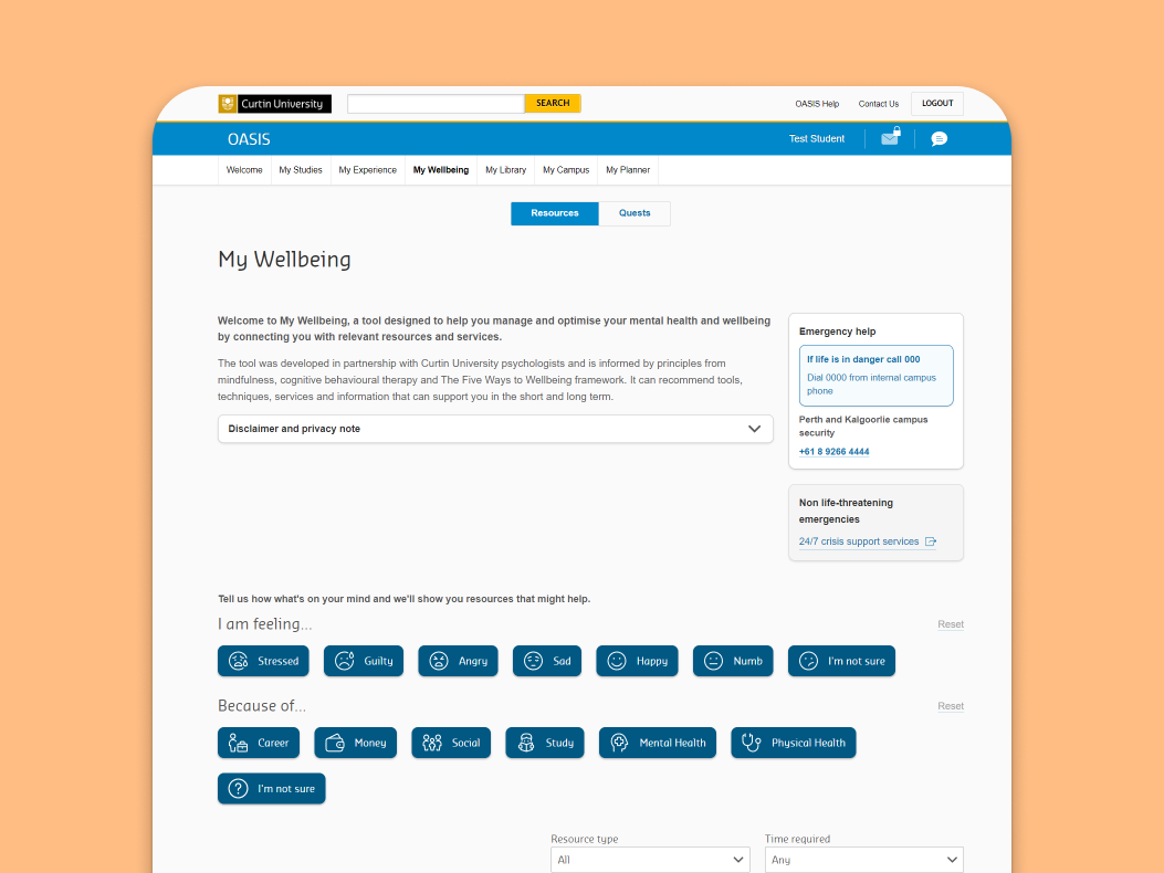
- Content editors have loved using the documentation for our component library and with more clear governance, site editors in other faculties are able to follow a more templated structure for their pages. Editors now have more freedom to create pages quickly, with fewer restrictions and more options for formatting.
Background
Curtin is one of Western Australia’s leading universities and is ranked in the top one per cent of universities worldwide (ARWU 2024). It’s an innovative, global university known for its high-impact research, strong industry partnerships and commitment to high employability of students.
I had the opportunity to lead the redesign of Curtin University’s website, with the goal of making it more modern, flexible, and user-friendly. This involved updating the design system, revising the website’s key components, and giving the overall site a much-needed refresh.
Scope
- Audit and UX/UI review existing website components
- UI/UX design new and existing components
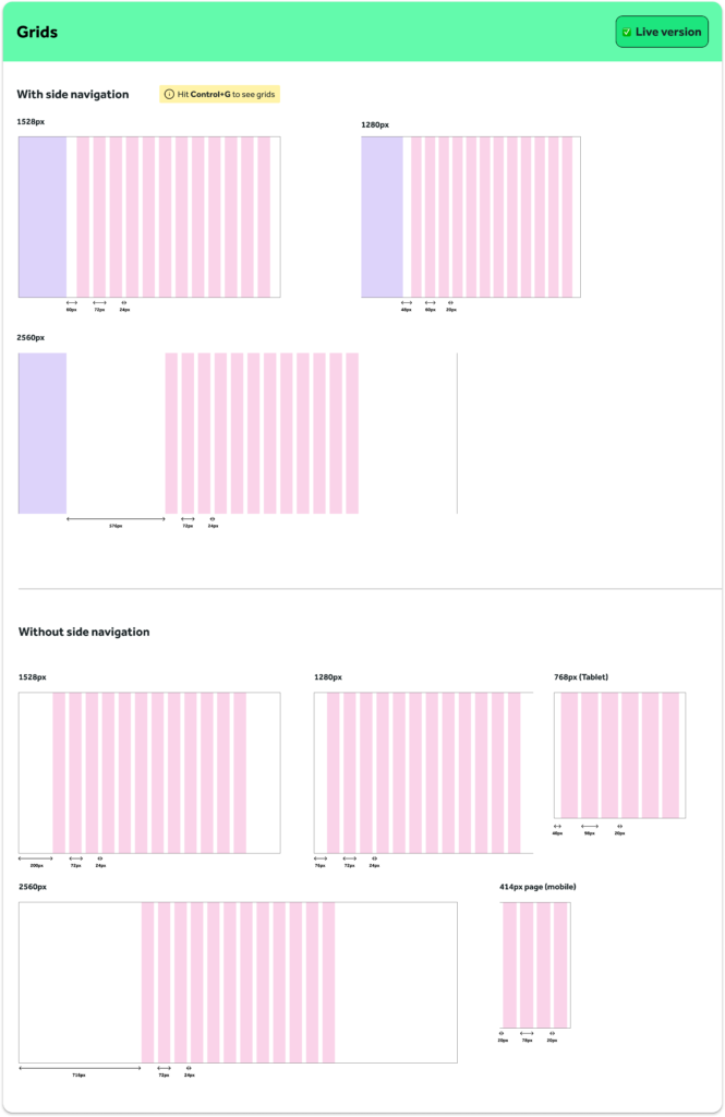
- Grid system and break-points
- Design system update including documentation guidelines
the process – part one
Discovery
Brand strategy review
Before diving into the design work, I ran a workshop with the brand team to clarify the direction we wanted to go in. We had two main guidelines:
Stand out globally
Curtin is a global player, so we didn’t want to follow the standard templates used by other Australian Universities. We needed something that felt innovative and unique.
Modern, but not trendy
They wanted something timeless. Modern, youthful, and fresh, but not something that would need to be redesigned again in a year.
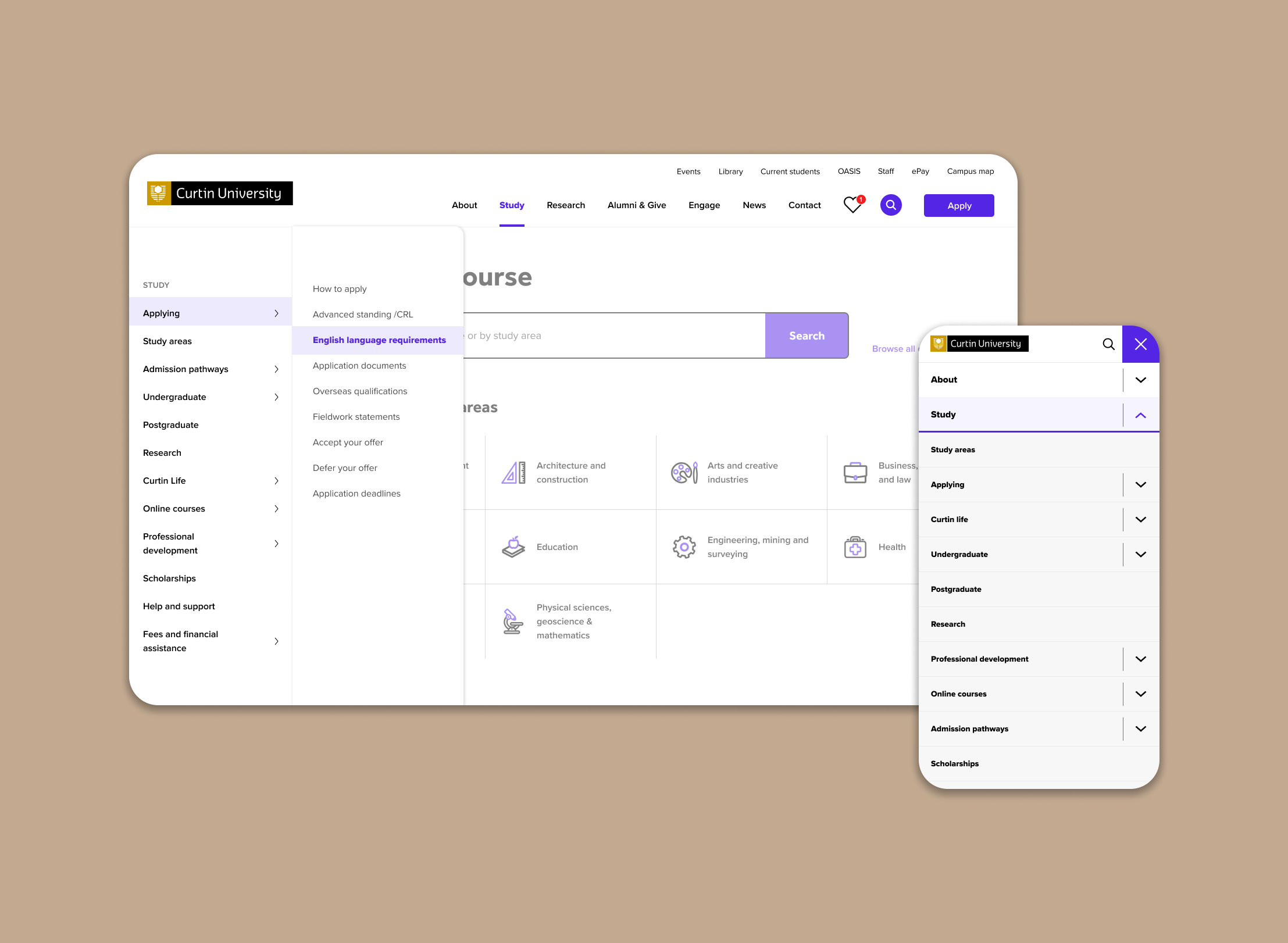
Component library audit
Next, I sat down with the digital marketing team (our main content editors) to gather feedback on how they were using the existing blocks and components.
Some key questions were:
- How are the current components being used?
- What’s working well? What’s not?
- What’s missing? What functionality do they need?
I put together a big spreadsheet mapping all 35+ components, documenting:
- What each component was for
- How it was being used
- Pain points
- Suggestions for improvements
It was a lot of information to digest, but it helped us zero in on where we needed to focus our efforts.
the process – part two
Design and development
Iterate. Iterate. Stare blankly at screen. Iterate
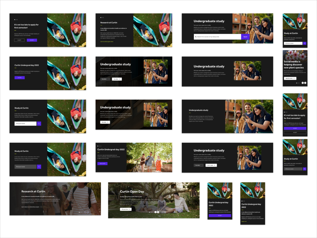
I’d be lying to you if I said this next part was organised. Redesigning over 40 components was no small feat. I kicked things off by tackling the card components first since they were the most frequently used and formed the foundation for most of the page layouts.
Masthead variations
I explored header blocks with and without CTAs to give editors more flexibility depending on the content of the page.
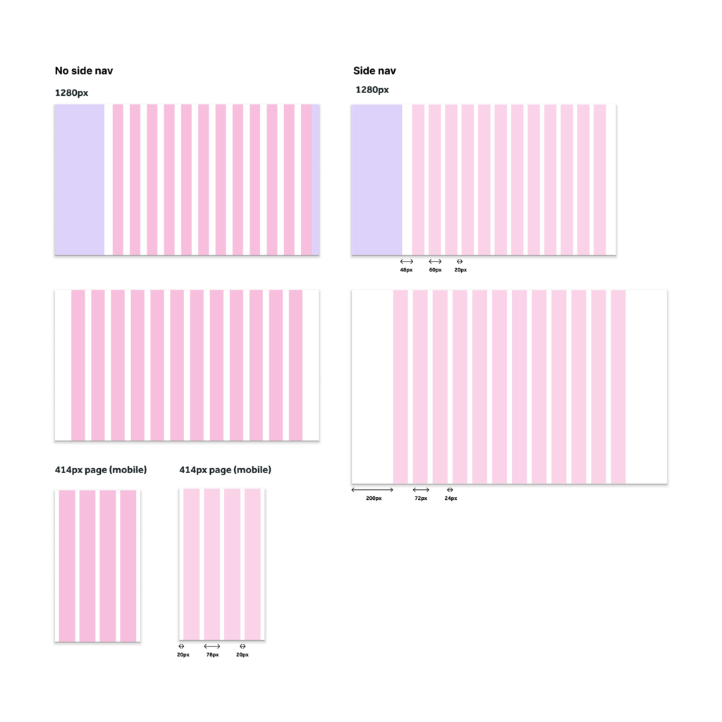
Grid and card development
I explored different column widths, number of columns and margin sizes. To avoid overcomplicating, I drew inspiration from the Google material design to assist in the basic structure and proportions.
the process – part three
Final website and design system
Website design
This version is currently live! Feel free to explore the Curtin website to experience the design in action.
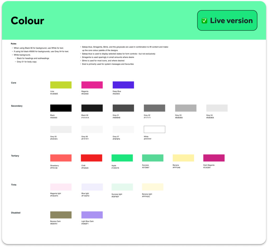
Design system and component library
We completely overhauled the existing component library and created new guidelines for designers, developers and site editors.
I also put a workflow process in place for designers and developers to ensure more seamless collaboration and communication going forward. This process includes design system governance to help the team keep the designs up to date and manage all assets without confusion.
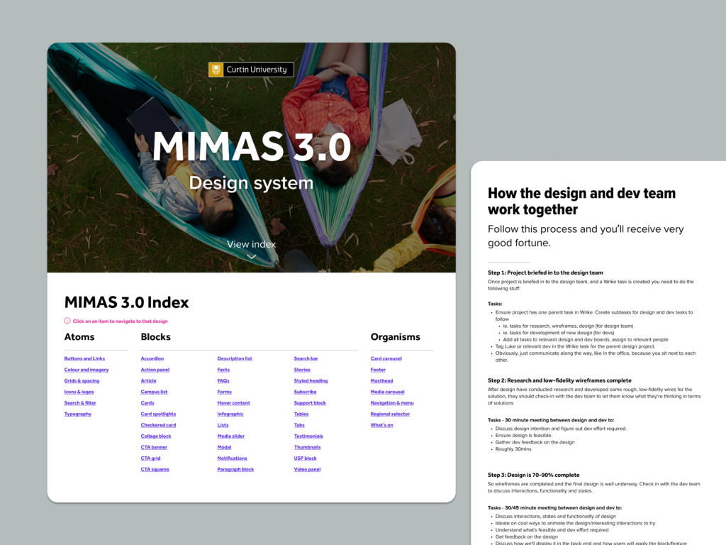
Final deliverables
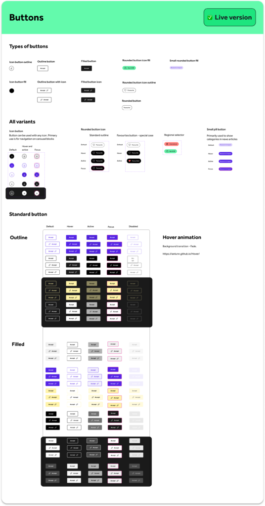
- Redesigned UI/UX: 35+ existing components and 5 new ones.
- Grid System: A responsive, more flexible grid with clear breakpoints.
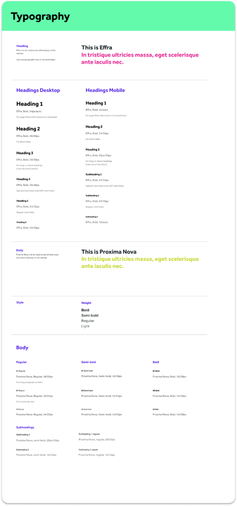
- Typography: Updated typography styles and font guidelines
- Design System: An updated Figma component library and documentation to help the team implement the designs seamlessly.
the process – part four
Reflection
Things I learned
Early in the process, I learned that the development team would start working on components before I had finalised designs. This led to some confusion about which version they were working on. I have since created a process flow in which devs can provide more input on the design before it’s complete, and for us to have designated design hand overs once the design is approved by the team.
Working under tight deadlines meant some components were rushed and small tweaks were missed during development. I’ve become better at estimating how long things will take and pushing back when I need more time. Design quality should always come first, even if it means asking for more time.