Designing the first digital wellbeing tool for a Western Australian university
Leading the design and deployment of a digital triaging tool that aims to provide better access to mental health resources for over 5000 students.
Overview
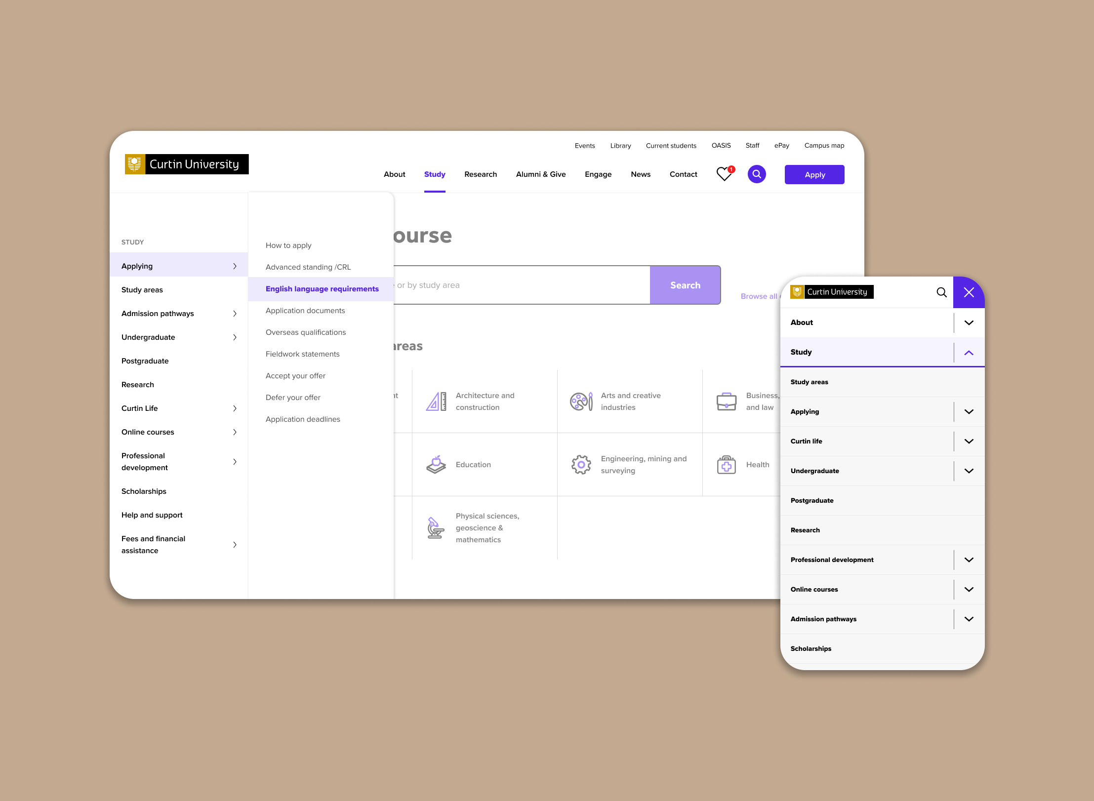
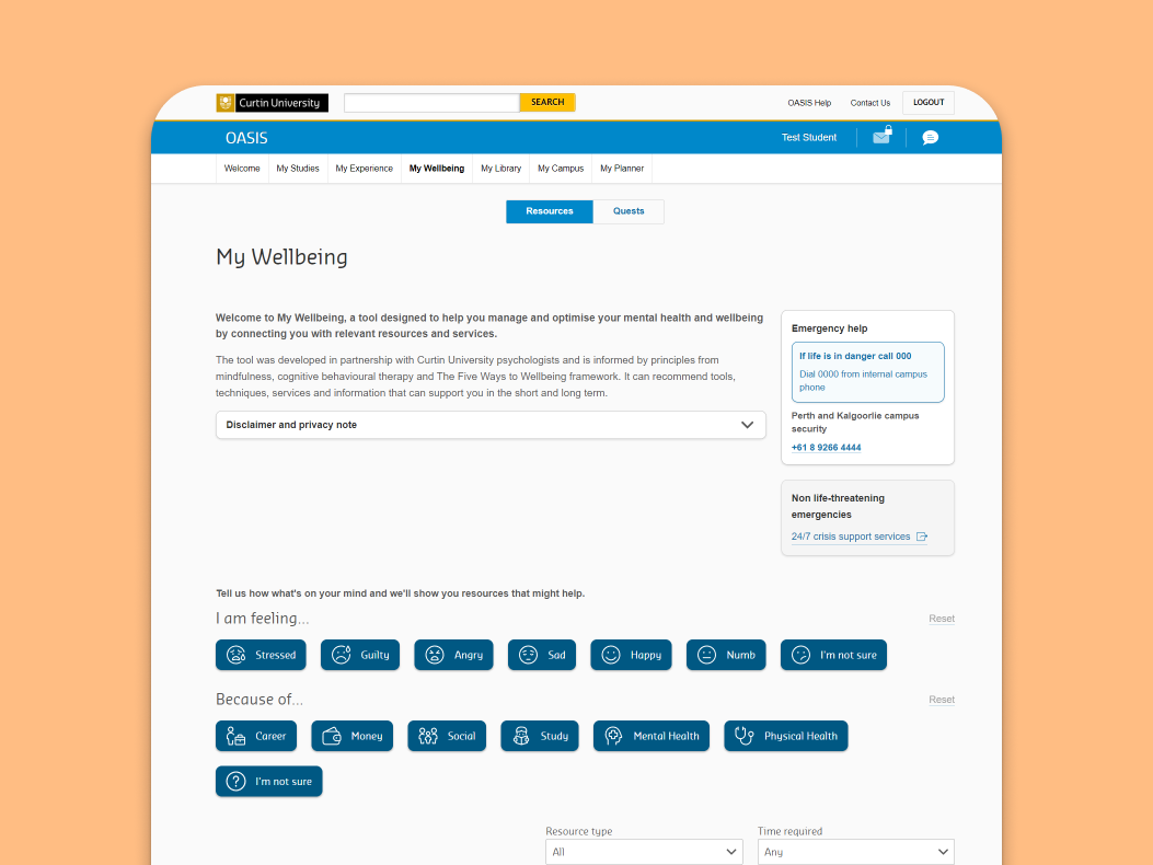
My Wellbeing is a digital pathway finding tool that provides students with mental health and wellbeing suggestions and resources based on their needs at any given time or place. It lives in Oasis which is an online portal that provides university students access to their student services.
The aim of this project was to improve the usability of My Wellbeing, refine the product strategy and release to a new cohort of test students.
Role
Manager of UX and development
Client
Curtin University
Services
Product strategy
Product design
UX Research
Workshop facilitation
Completed
Sep 2024
Background
When I first joined the team, and was briefed on this project, My Wellbeing was in its beta phase. It was functional but not yet ready for a full-scale rollout to the entire student body. The team had recently completed a round of quantitative testing with a group of online students, but the results were mixed.
While the product certainly had potential, it was clear My Wellbeing was not effectively solving the needs of students or addressing the team’s original problem statement. It was my role to lead the next phase of development and help the team reshape the product.
Scope
- Refine product strategy
- Improve product design of My Wellbeing
- Release to pilot cohort
the process – part one
Discovery and problem definition
Review the existing product strategy and get up to speed
I scoured all internal resources (and the brains of my team members) to learn about the product and to understand what was driving design and strategy decisions. This included exploring the team’s database, conducting a heuristic evaluation on the current state of the tool and reviewing past user testing documentation.
I then held conversations with key stakeholders to understand the broader university strategies and determine how they influenced or aligned with our project.
I discovered the following key themes after my initial discovery
Universities care more about student wellbeing than ever before
This means more funding and initiatives in the mental health space, as well as an additional pressure on our counselling and student advisory services to deliver greater care to students.
Counselling services at Curtin are overwhelmed and My Wellbeing is supposed to help
There is a long waiting list to see a counsellor at Curtin. My Wellbeing was initially conceived as a way to help alleviate some of the pressure on these services by providing students with mental health support while they wait for their appointment.
There were a few little holes in the product strategy
Foundational user research that informed My Wellbeing suffered from a few issues: leading and closed interview questions, a non-representative participant sample, and feedback gathering on specific digital products. It was clear the strategy was driven more by the desire for a digital triage tool than the pain points of students and counselling services.
This made me question the entire strategy and I wondered if we were heading in the right direction.
Stressed students found the tool frustrating but could see it had potential
While students liked the content and the concept behind the beta product, they felt it was too complicated to use when they were stressed. There were too many steps in the triaging process before they could access helpful resources. The experience risked becoming more of a burden than support system.
We were trying to do too many things…
- Reduce pressure on counselling services
- Prevent students from entering mental health crises
- Help students manage their mental health and be more aware of their emotions
- Improve student grades and overall wellbeing
No wonder the product was struggling.
We needed to refine the problem we were trying to solve with My Wellbeing.
To better align the product with student needs, I worked closely with our product owners and stakeholders to narrow the focus of the next phase of the project.
Our revised problem statement
How might we ensure students who are seeking support have easy access to information that can help them help themselves in times of stress?
This more realistic problem statement prioritises access to information as opposed to triaging and providing tailored recommendations.
I emphasised the importance of phased product development here. We were under a tight deadline with very limited resources – if a bespoke wellbeing dashboard was our Ferrari, having more accessible resources would be our unicycle.
the process – part two
User research
Round 1: Testing with current university students
Approach
- 10x 45-minute testing sessions with current Curtin students.
- Participants were selected based on strict criteria to ensure they represented the target audience.
- Moderated, in person sessions were a combination of usability testing and interview questions.
Research goals
- Understand the mindset of a distressed student. What do they think, feel and do? What are the critical moments in the journey when seeking support?
- Gather feedback on the current state of My Wellbeing to identify the pain and delight points of the user experience
- Understand how much value the tool is adding to the students experience, if any at all
- Validate previous research findings and identify gaps in the understanding of student needs.
Example tasks
Part 1 – Understanding student stress
- “Tell me about a stressful experience you’ve had at university, one where you wanted more support than usual.”
- “When you were feeling this way what helped you feel better, if anything?”
Part 2 – Usability test of current-state product and observe
- I want you to hold that stressful experience in your mind for a moment while you answer the next couple of questions
- “Imagine you’re feeling [emotion] right now. Can you find a Curtin resource that might help you?”
- We observed their interactions with the tool and prompted with additional questions as needed.
Key insights
Students need easy and direct access to the resources that will help them, especially when they’re stressed.
Support resources need to be ‘right there’ – This might seem obvious but this need wasn’t supported by the beta version.
When students are in a stressed state they need, and expect, the information they’re looking for to be easily accessible and frictionless to access. They don’t want to waste time navigating through complex interfaces or multiple steps.
My Wellbeing tool could be an additional thing for students to juggle
The tool’s complexity was a barrier. While students found the content helpful, the effort required to access it was a source of frustration. This was especially true when students were already experiencing high levels of stress. Students felt unsure if it would make their lives easier or add to their stress levels. We knew this one but it would good to validate it.
Students want a way to track their progress, and return to helpful resources
The ability to track progress and easily return to helpful resources was a common suggestion. This feature would not only help students engage more consistently with the tool but may also foster a sense of progress and agency.
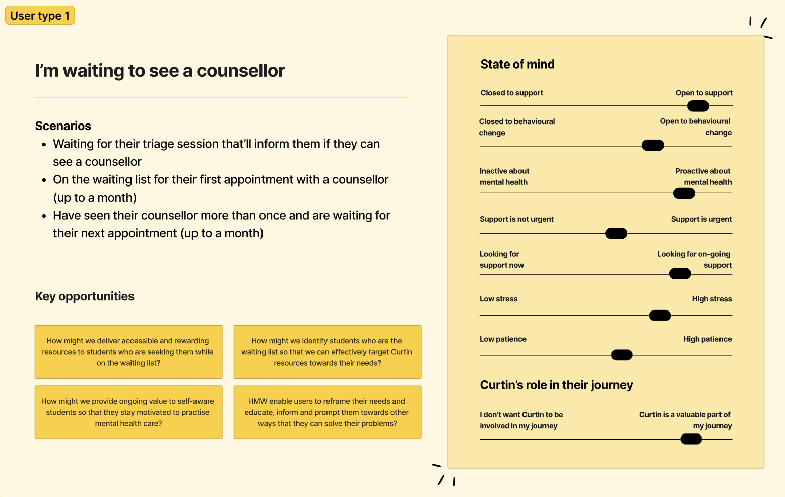
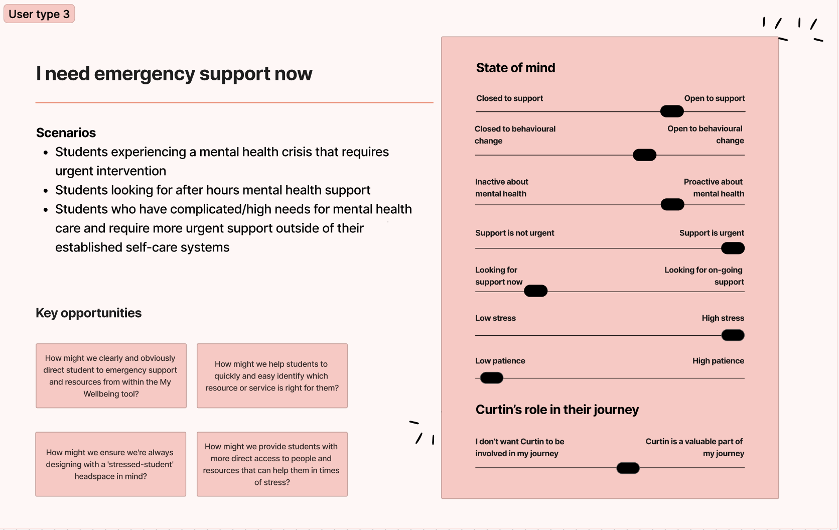
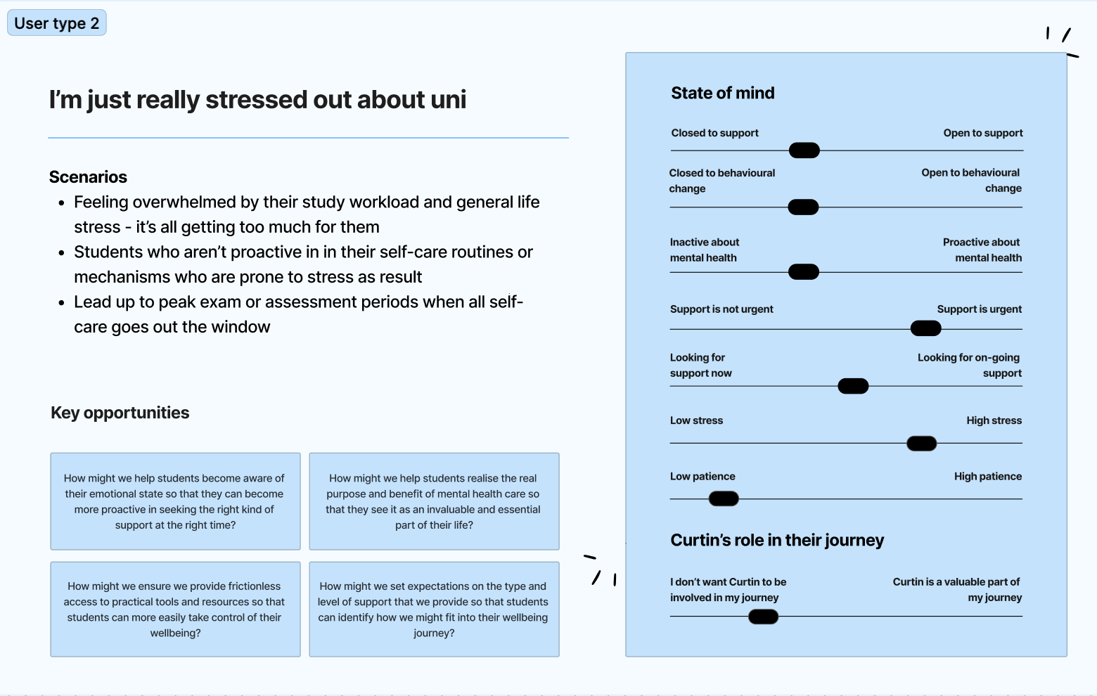
Student personas
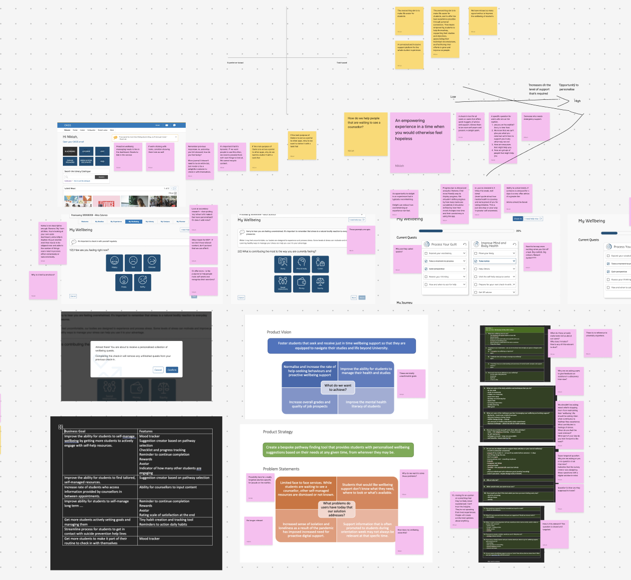
During our research analysis, it became clear there were notable differences in how students engaged the university for support depending on how stressed they felt, and the type of stress they were under. This rich data was enough to create a three rough user types to bring these core themes to life. We used these in future design workshops to help stakeholders empathise with our students.
Key design recommendation
Make it more simple.
Students wanted much easier access to helpful resources and they wanted to easily identify resources that could help them.
This could be done by reducing the number of steps required to access helpful resources and removing complexity in the UI. By streamlining the process, we could make it easier for students to find what they need without feeling overwhelmed.
the process – part three
Design and development
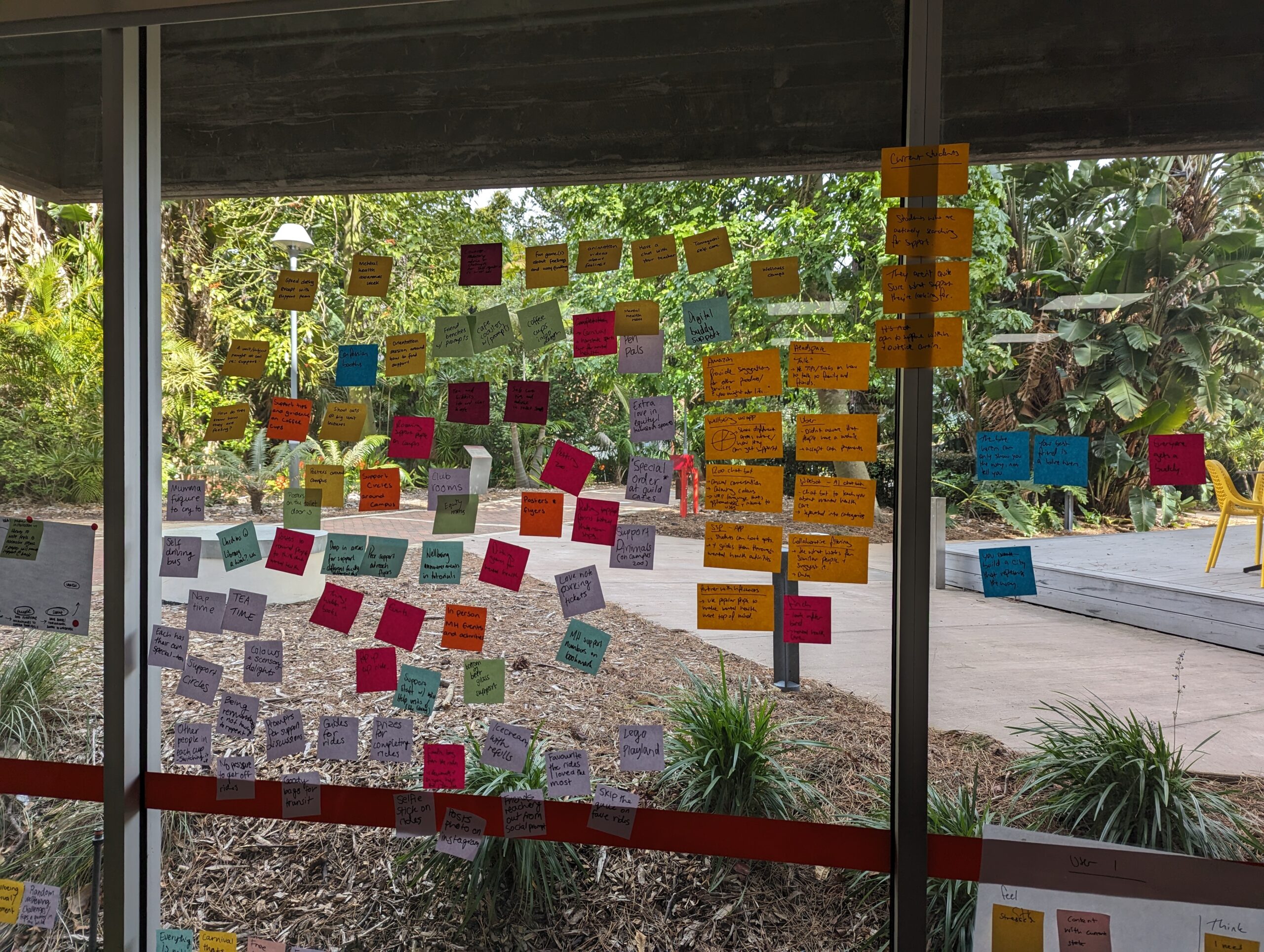
Ideation and strategy workshop
Charged up with some great user insights, I led a design workshop with the following objectives in mind:
- Deepen the team and stakeholder understanding of our users (through empathy mapping)
- Define our minimum valuable product
- Set a collective understanding for our long term product strategy
The workshop also helped strengthen relationships with stakeholders and build trust in the design process.
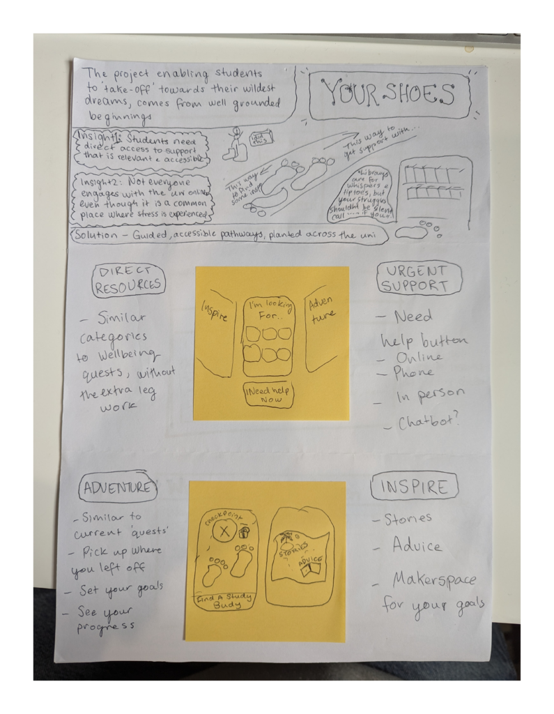
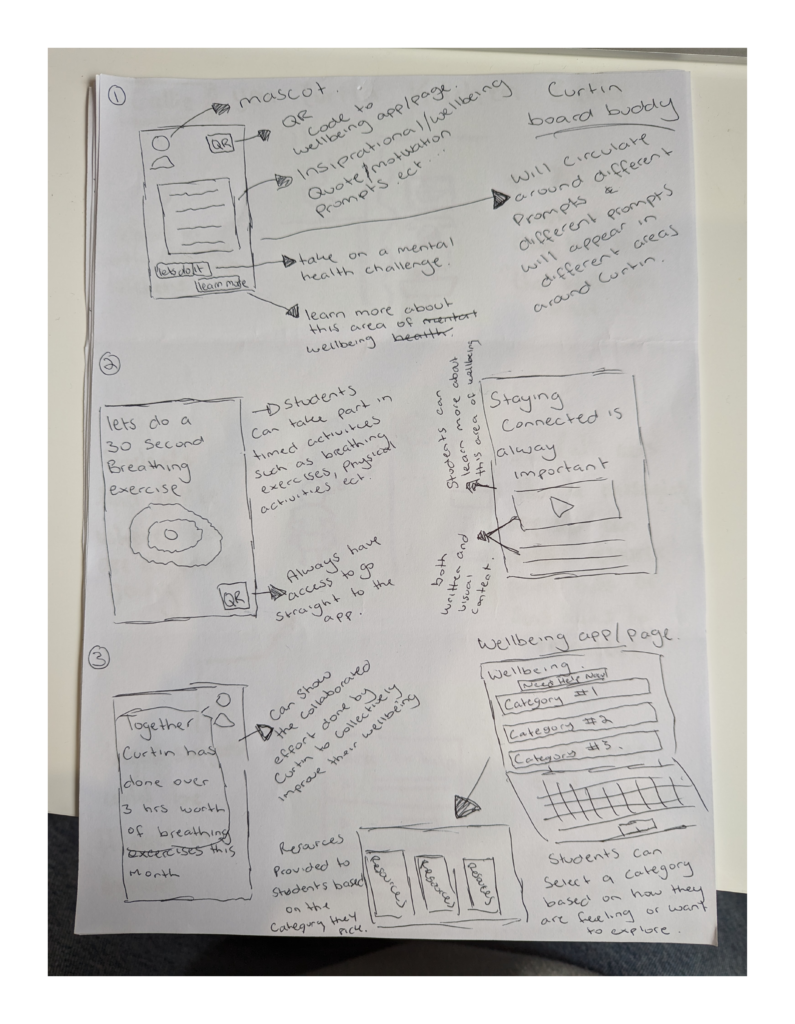
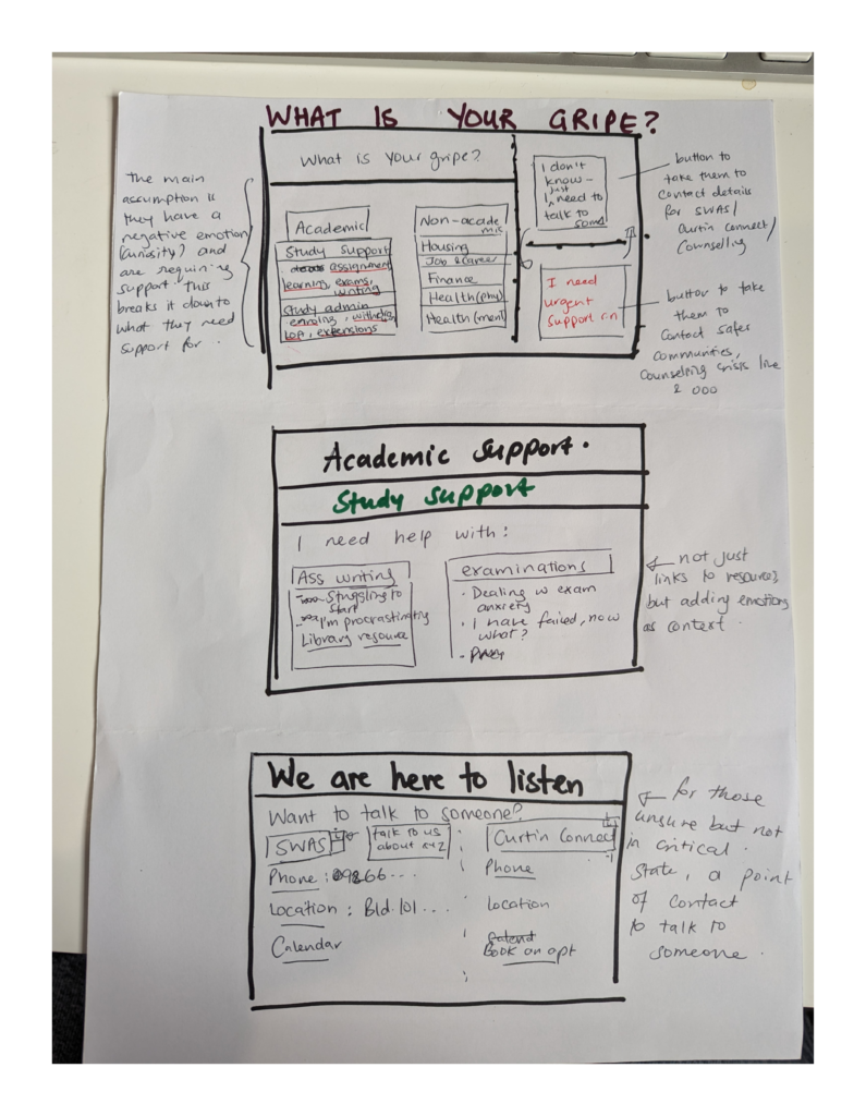
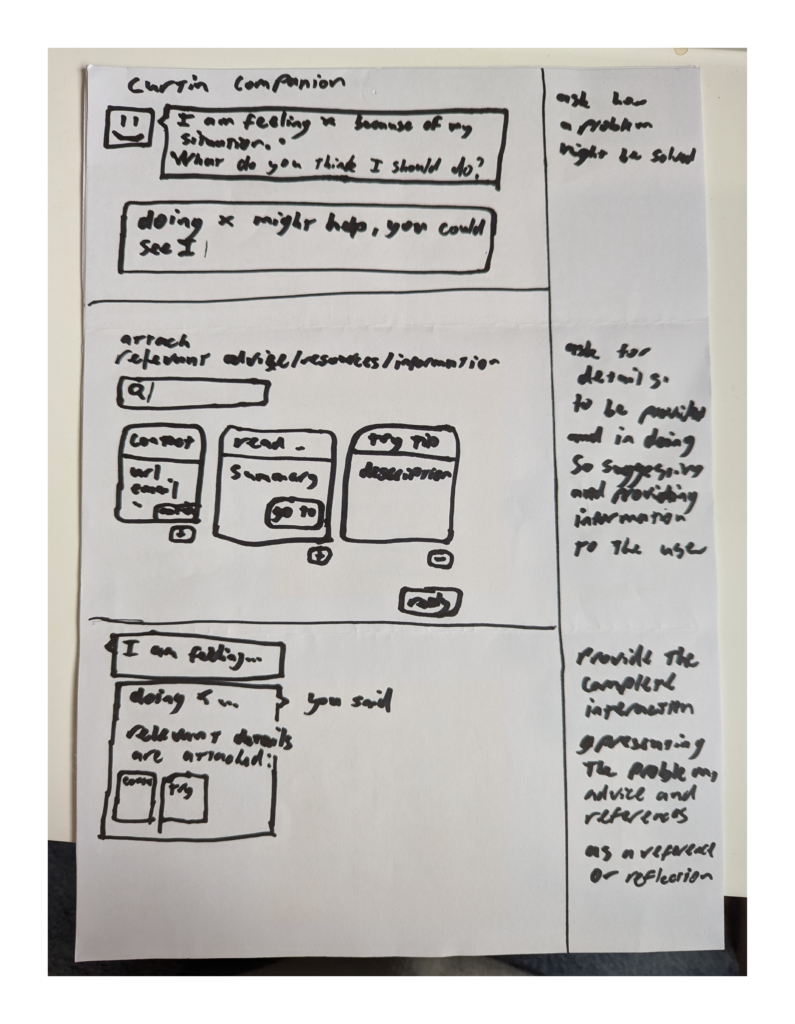
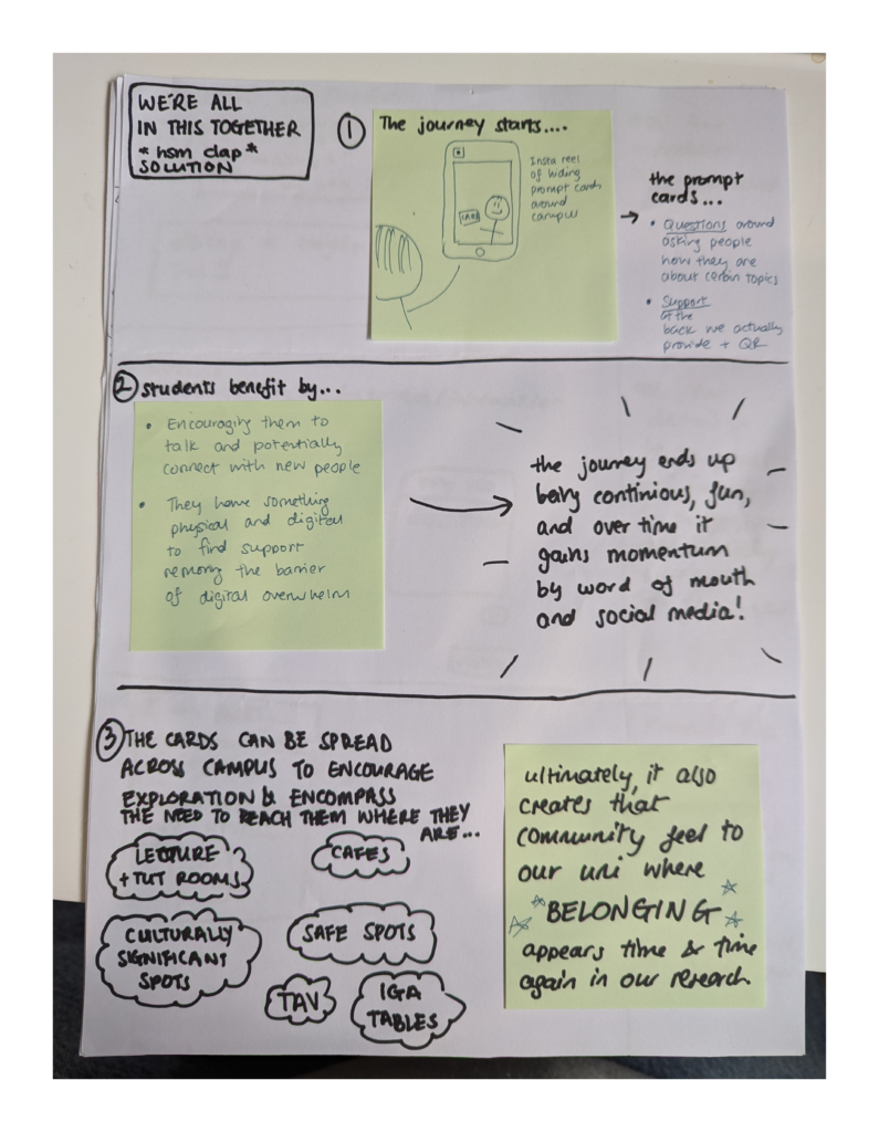
Outcomes from the session included a bunch of brilliant ideas to consider for our long term strategy as well as paper prototypes of our product dream state.
Paper prototypes of My Wellbeing dream state

Wireframing, prototyping and usability testing
We used the ideas and dream state vision for My Wellbeing to create a couple wireframe options for MVP.
Option 1
Here we tried to retain much of the existing flow of the experience so that we could avoid wasting any development effort already spent. Not my favourite option but it would be achievable for our release date.
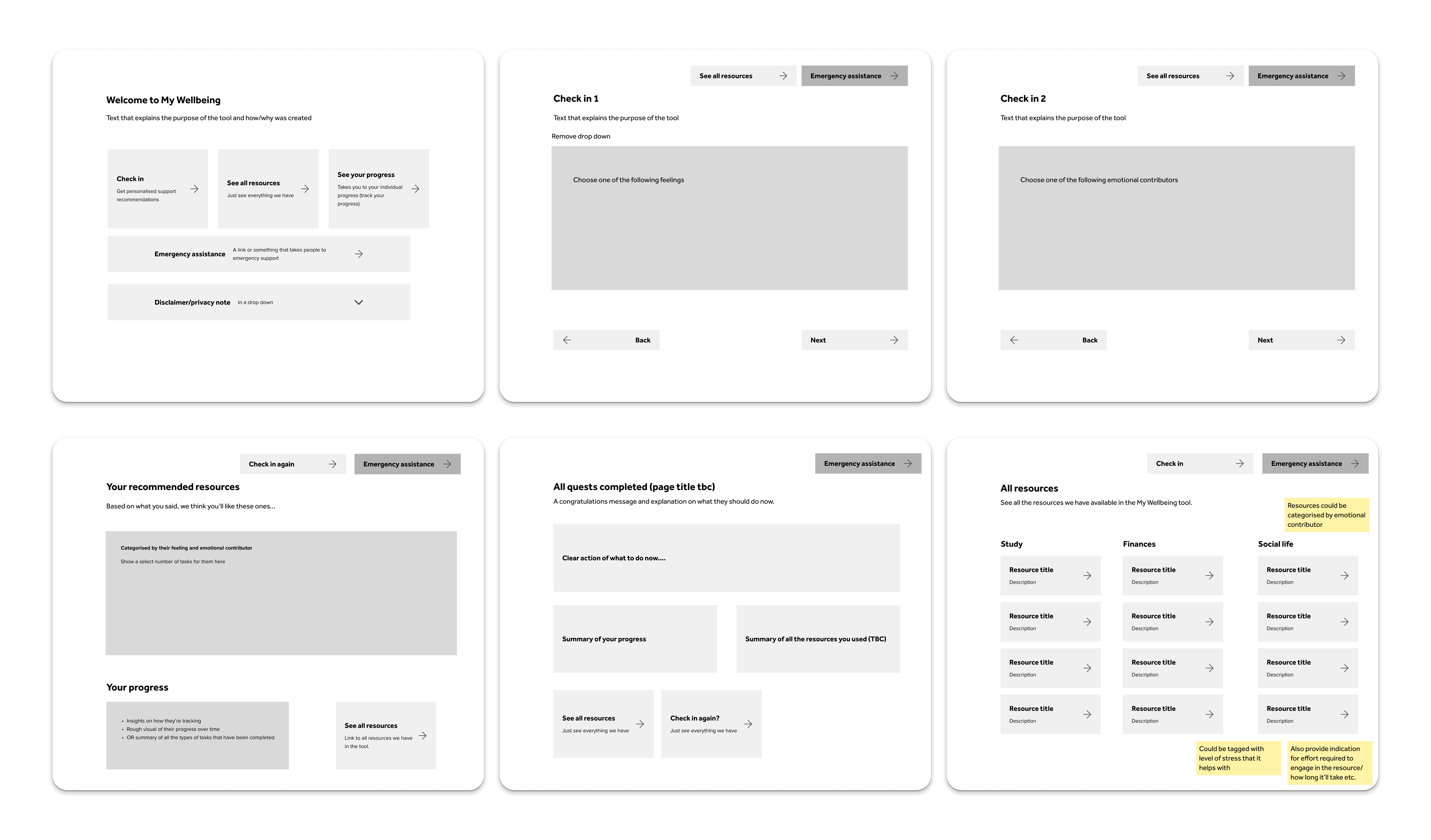
Option 2
Here we reworked the design to focus on simplicity. Now everything is on one page – we focus on filtering and sorting content instead of triaging. This allows students to easily find content relevant to their situation and doesn’t rely on multiple questions to be answered first.
After a quick round testing, we found option 2 was a clear winner.
We tested with 5 current students and used A/B testing to compare the two prototypes. Students expressed they would rather just have access to resources and didn’t want to be bogged down by too many options.
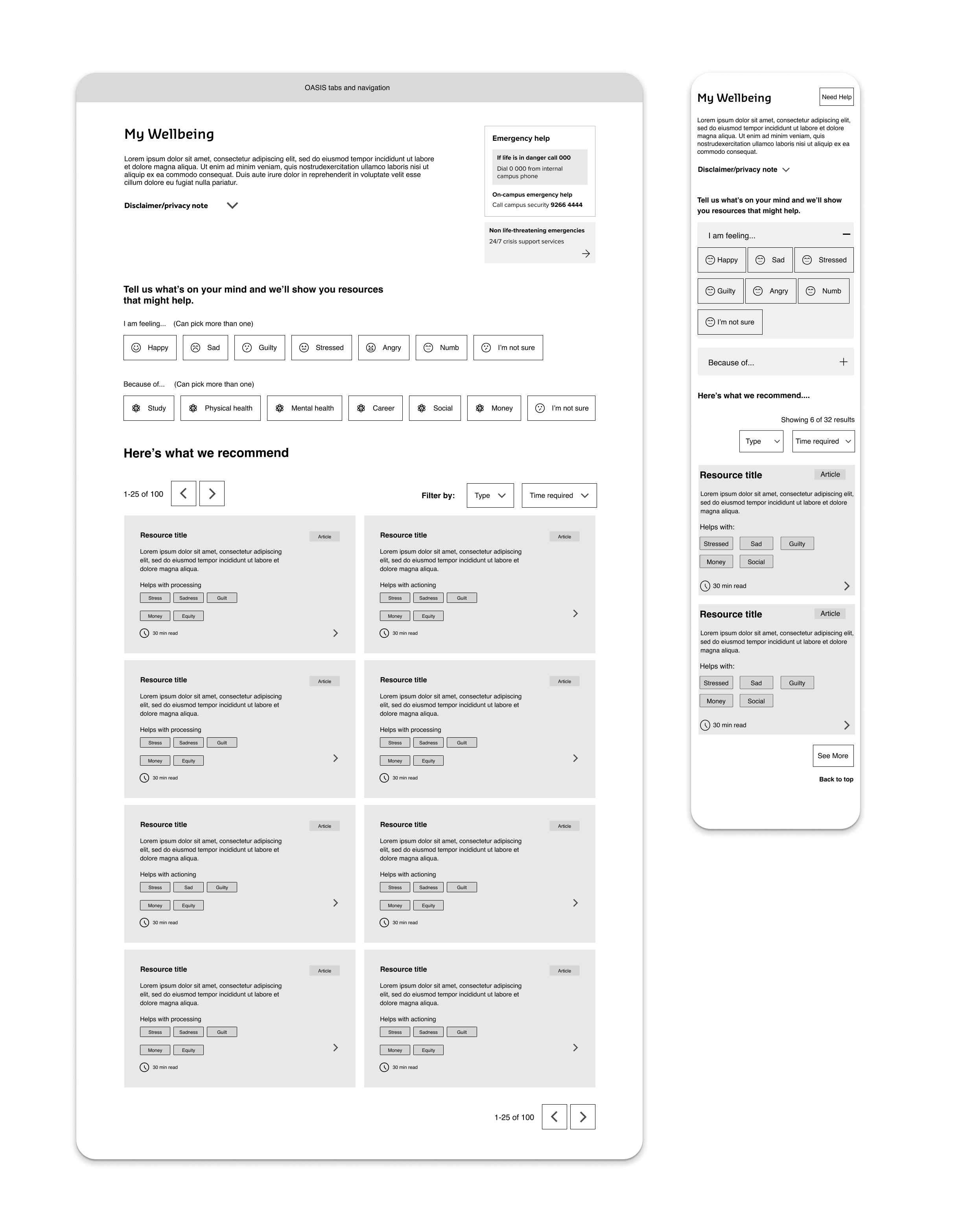
We created a high-fidelity prototype in Notion and conducted a third round of user testing.
The decision to jump from Figma to Notion was to provide us greater flexibility, we used it for the following:
- Make quick changes to content and work collaboratively with other teams to refine the experience
- Refine all content, categorisation and tagging
- Refine the filtering experience and test additional sorting features
- Get accurate feedback on content and functionality
- Use Notion as a content management system going forward
the process – part four
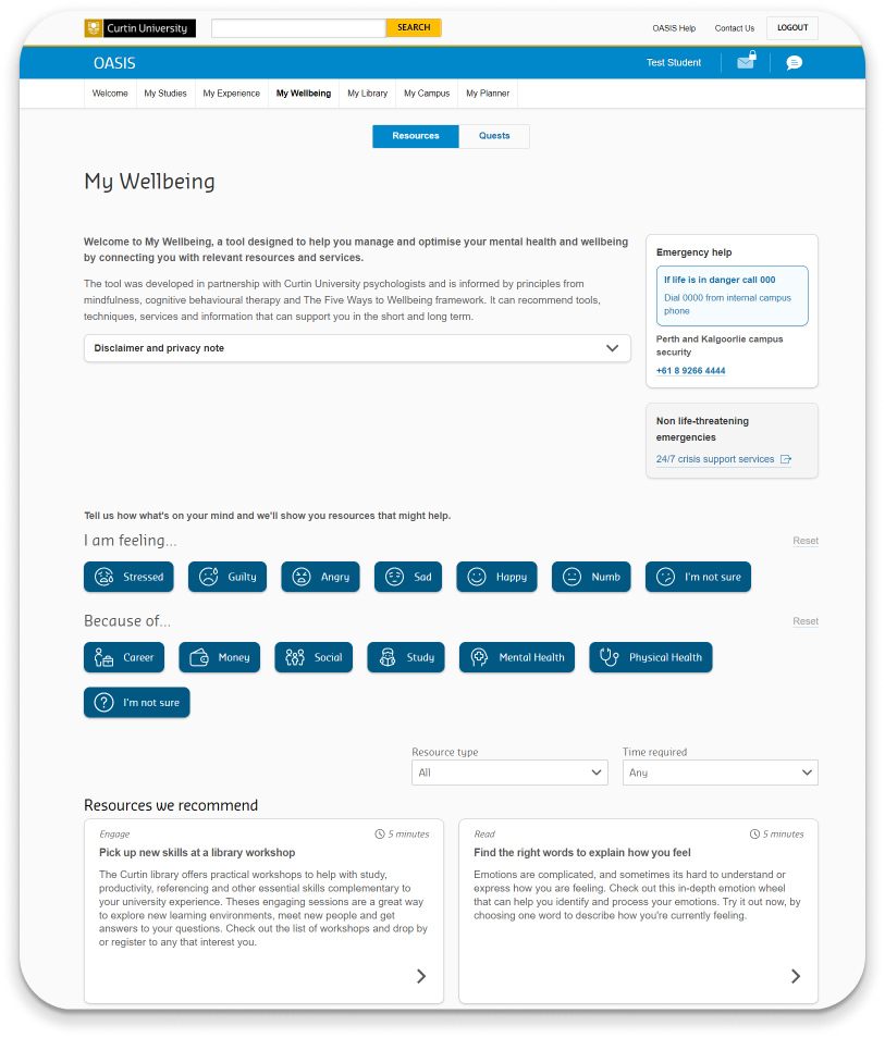
Final product design (beta)
The final version of the tool, which simplified the experience and focused on easy access to resources, was well-received by stakeholders. They seemed to appreciate the shift in design, as it more directly addressed the needs of students experiencing stress.
Just before I left the team, we released this version to a pilot cohort of students for quantitative testing and had planned a round of qualitative testing in the coming weeks.
the process – part five
Reflect
Final thoughts and learnings
While great in theory, the more complicated beta version did well to partially solve multiple problems. Considering the time and budget constraints of the team, it would have been incredibly difficult to refine the features enough for students to at least not be frustrated with the experience and at most, like it enough to use it again.
Although we removed many of the beta features, it was clear this revised, simple tool will set the foundation for regularly gathering rich user insights and allow us to take smaller but more frequent steps towards developing the wellbeing dashboard. In this case, we learned the value in delivering small, testing often and failing fast.
Ultimately, the entire product is guided by the dynamic needs of students. I’m curious to see how the product continues to evolve as the team learn more about the behaviours of students.
Advice for my future self
Better to deliver one really great feature than 5 average ones.